The capstone course. William Allen-White's pivotal moment in its Strategic Communications disciples' tenure. Campaigns.
That kind of rubbish is what every strat comm journalist student heard for four years. "It's gonna kick your ass." "Last year's class didn't sleep for a week." "The plans books are a hundred-pages alone."
It was all hot air. Perhaps it was the team I was assigned to, perhaps it was the inherently fun and goofy client, but by any measure, the dreaded Campaigns course was, ultimately, a very happy memory.
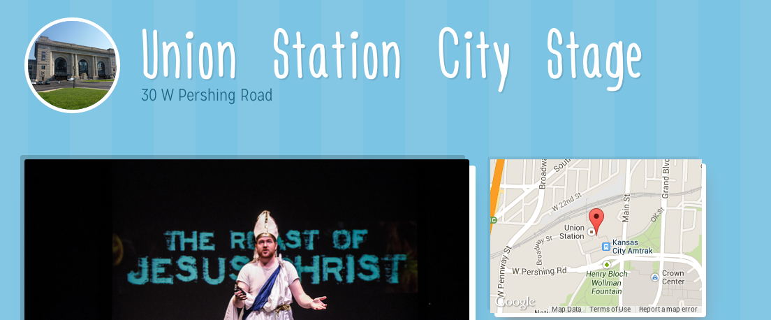
Assigned to come up with a campaign that would entice the 25- to 34-year-old demographic into attending KC's city-wide independent arts festival, our team competed against five other groups for the Fringe's choice pick on presentation night—a moral victory and an automatic A.
Our squad spent some late nights and some long library afternoons over the millstone, but moreover, it was a barrel of laughs. There was friction here and there, but by the end of the semester, we all felt exceptionally accomplished. We won.
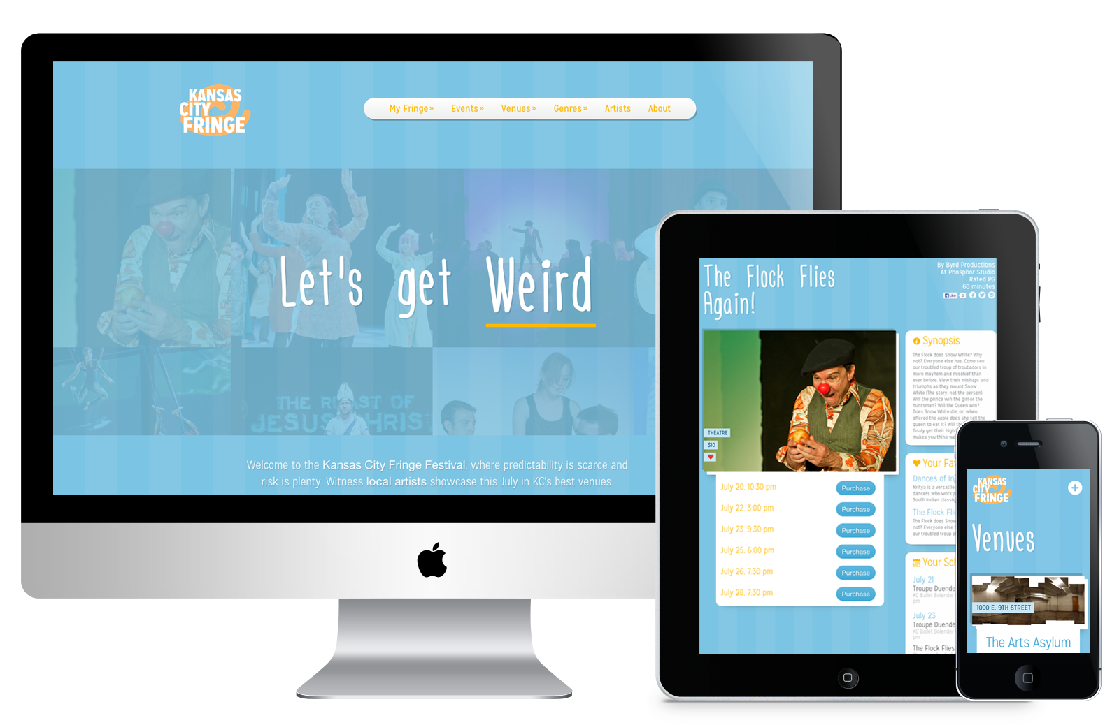
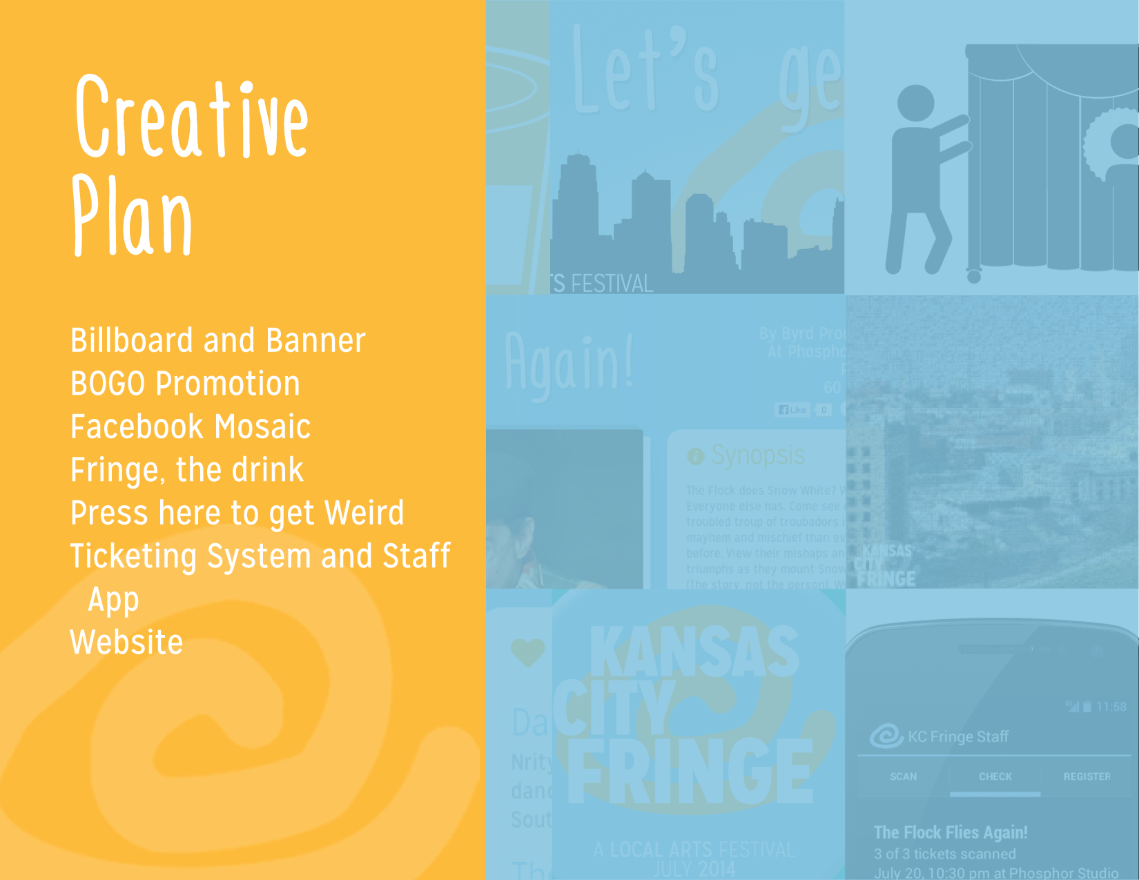
Website
For every great love, there's a great beginning. Yaaak was mine into the wonderful world of Ruby. After writing PHP and chunky HTML for years, I've never felt more at ease than behind the keys of a Rails script. The block indentation, the intuitive if statements, the database management, the CRUD model, the MVC structure... just beautiful.
The Fringe website was my rabbit hole to fall down. I learned the Slim template structure, intermediate database querying, and a cascade of Ruby logic and Rails trickery in a month-long trial by fire. Absolutely gorgeous. Save deployment and resource management, I'll happily preach the good news of RoR to the world.
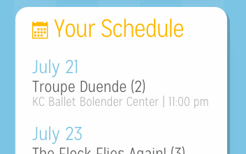
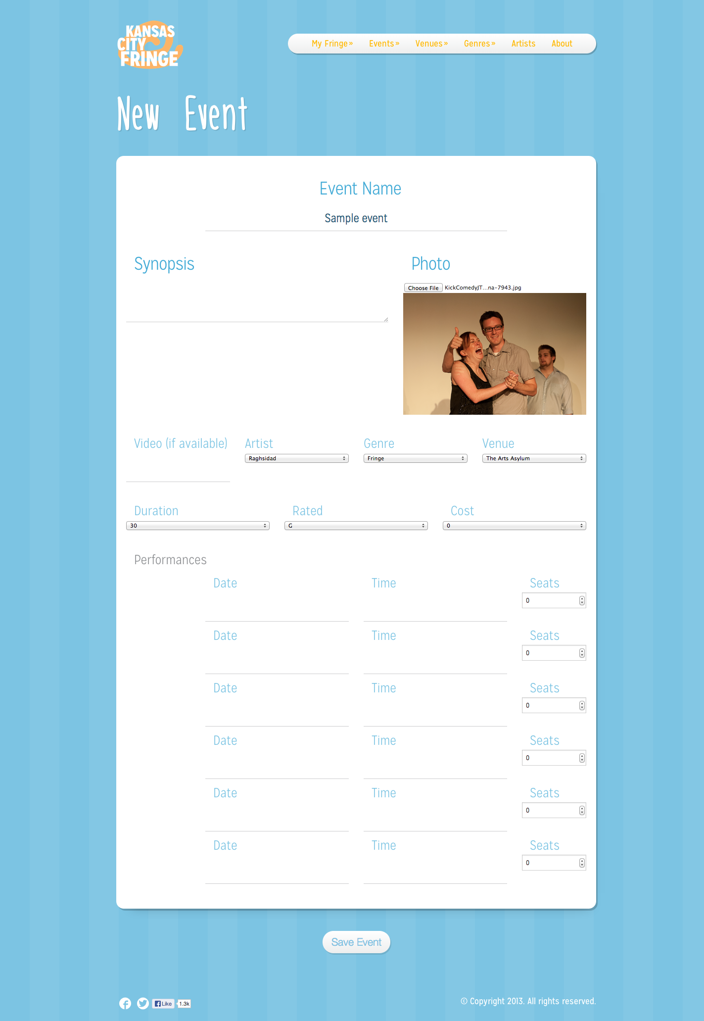
The site had to be "for the people." Discrepancies over programs and organizational methods became a barrier of entry for potential attendees. With a little Isotope.js magic, the shows pages are filterable and quickly navigable in whatever sorting method the end-user favors. Shows can be favorited and saved for later browsing; the schedule is readily available to notify of any potential conflicts before purchasing another ticket.
Lastly, it had to be playful. L'Engineer, the font, is more predominant in this design than in the other campaign elements because of its flexible, carefree, handwritten style. The blue is approachable, and the stripes make everything feel a little more at home.
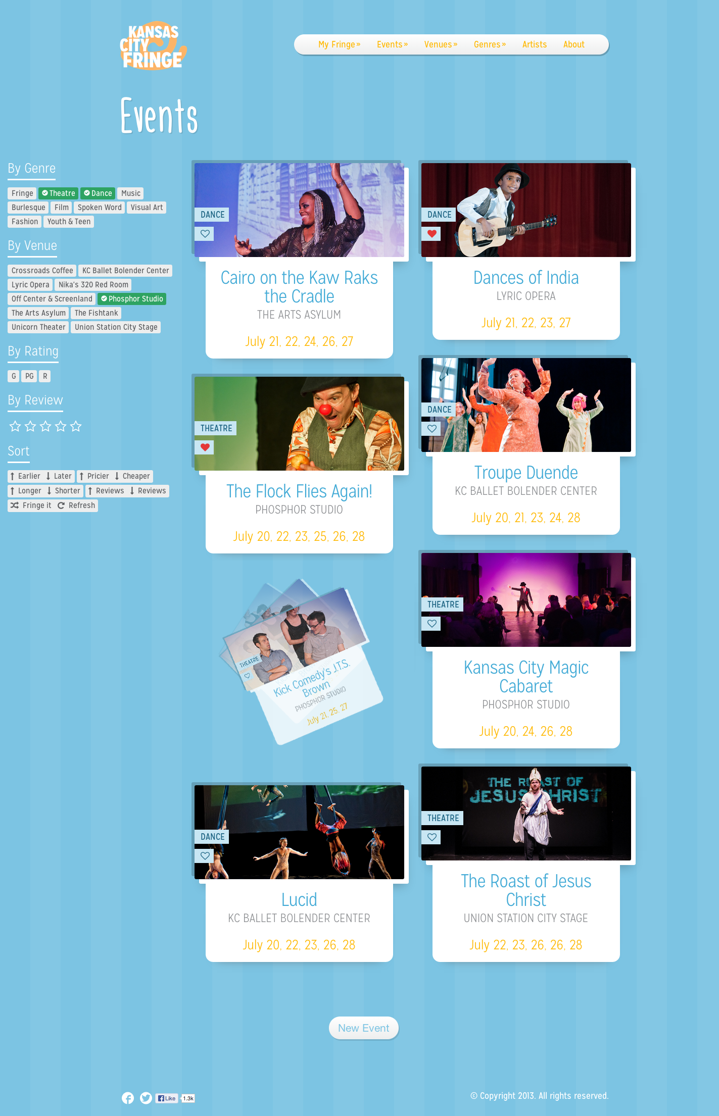
Consumer-side
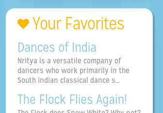
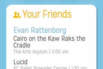
There also had to be a social element. The gimmick of this website allows users who have authenticated with Facebook to see what shows their friends—provided their permission—are attending.
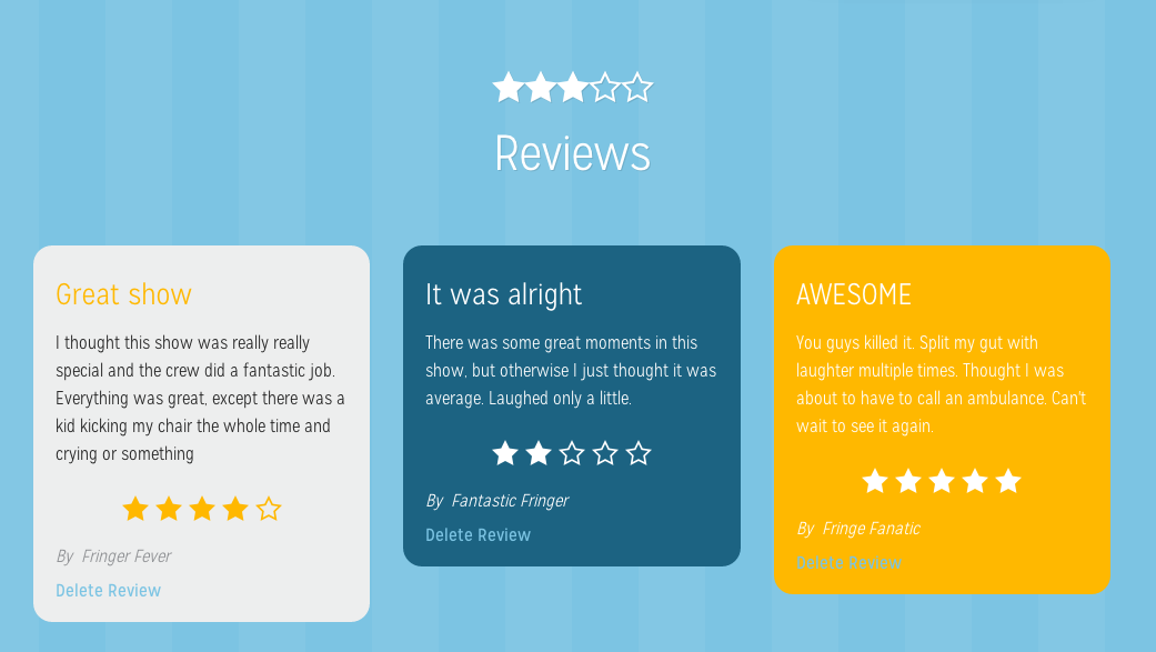
Reviews can only be submitted after a user has had their ticket scanned at an event
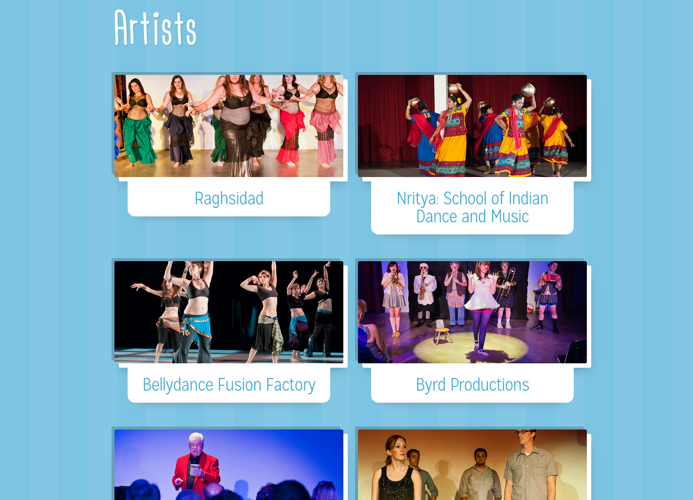
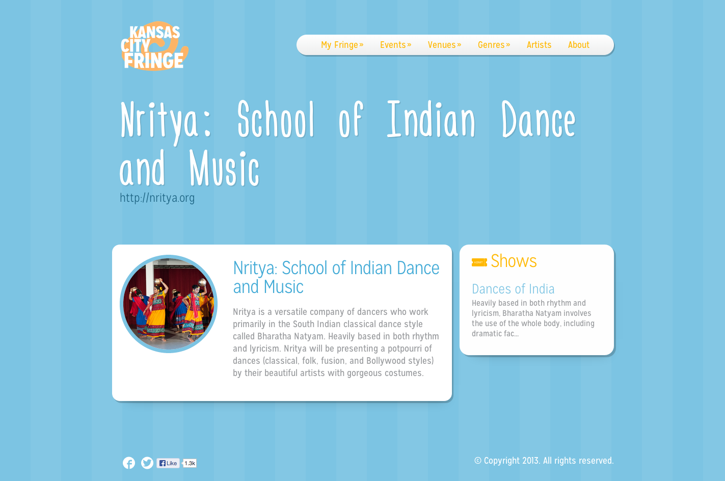
Artist highlights and venue depictions are also more efficient with individual pages that offer more space for bios and images than the printed brochure.
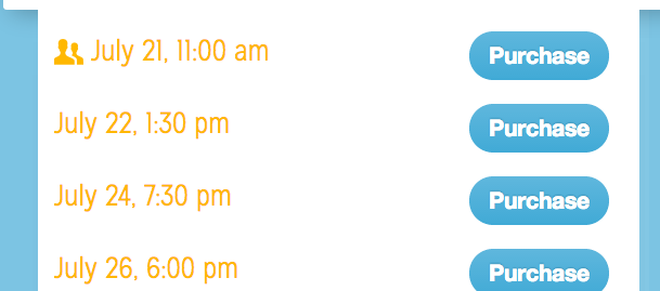
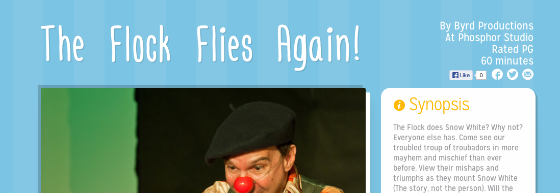
More ticket information can be gleaned from links at the top of every event page. All meta objects click through to a page with similar events, i.e. a 90 minute show will link to an events page that lists all shows at 90 minutes.
Venue detail
Author detail
Event detail
Staff-side
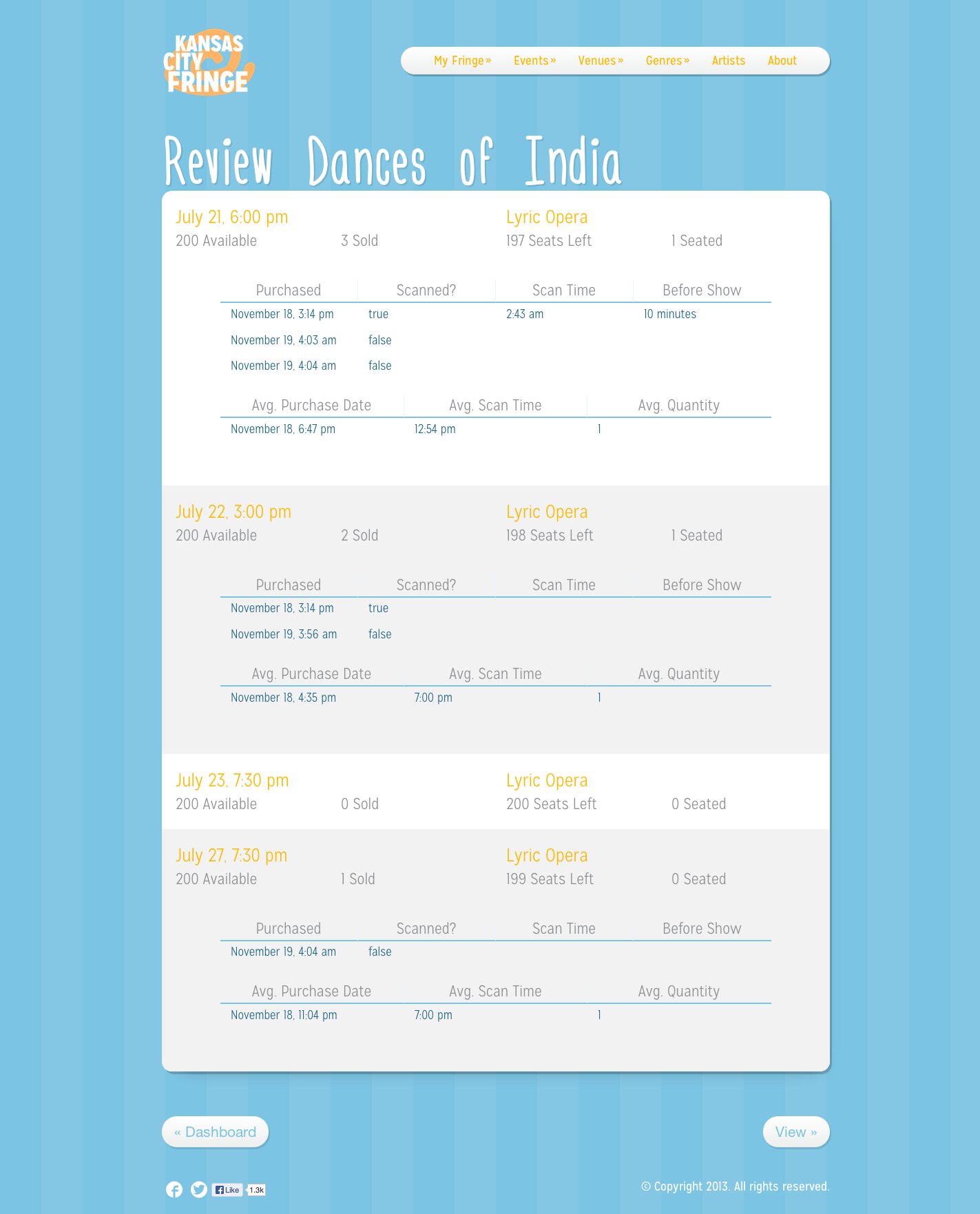
On the staff side, there's analytics, ticketing info, user management, attendance averages—the whole 9-yards. And, like my WordPress themes, I wanted the entire site to be editable. Or at least the content, with interfaces to add, edit and delete Events, Venues, and Artists.
Book
Our book (with the research and competitive elements omitted in the version above) topped out at 89 pages. Most books clear 150, some 200, but we were always careful to keep writing punctual and relevant. If we wouldn't read the whole thing, why would the client?
I was responsible for all of the design, and I wanted to keep it intentionally simple and out-of-the-way. Barely noticeable, but consistent. Since we pitched branding in our plan, we had to abide by the rules just as well. Except for photos, the color palette for the whole package is six colors—black, white, blue, orange, dark blue, and dark orange. There are only two fonts. It was a great relief to have those self-imposed restrictions because it cut out a lot of the work, but crafting a visual identity that just looked cohesive, over nearly 100 pages, was nonetheless a frustrating task at onset.
Eventually, the design just started to live its own life. Pages fell together from master spreads, Mission Gothic's rounded edges complimented the swirl watermark, and hallmarks like white-outlined iconography and tiled section leaders just sort of meandered in. I hold a lot of pride in these designs, because it truly feels like it started as a child that, while slow finding its first steps, crossed the finish line at a full sprint with instinctive strides.
If the above feature isn't functioning, the PDF is available for download.
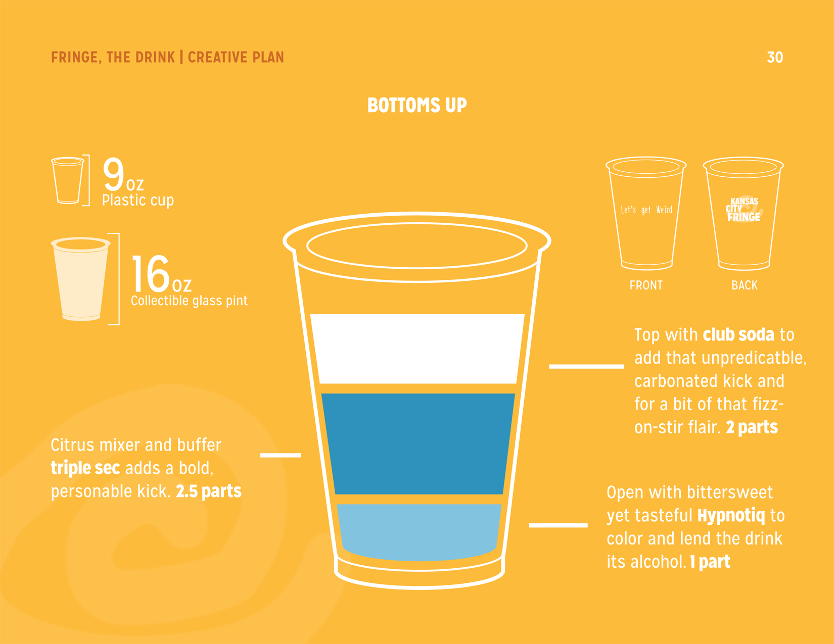
The majority of the book relies on the friendly blue tone, but our creative plan—the meat and potatoes—had to stand out. So it's orange. At first it was kind of like that aforementioned child coming home with a loud tattoo, but you know what kid, that doesn't look half bad.
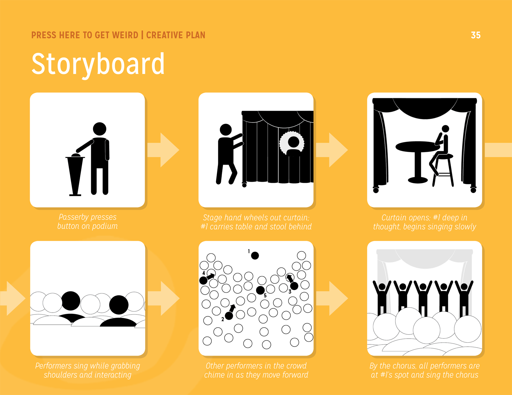
Even the icons and graphics (something I'm gradually improving upon) came out identifiable. Simple. Unintruisive. The storyboard illustrations in particular will forever provide a grin. Although the white background isn't the best presentation, and admittedly these are not the best stick figures you've ever seen, the rehearsal is communicated.
Most of these photos were shot by friend and habitual bike-rider Max Mikulecky, who remained at the blessed beckon-call for this project. The exchange was photos for his Santa Fe Project. The rest were by our professor Mugur Geana, who had shot Festivals of yesteryear.
I contributed writing on pages 16-22 and 35-46, with editing on the longer forms (16 and 17) coming from rockstars Evan Rattenborg and Jeff Kitchel. The other sections were penned by Evan, Jeff, Wylie Bott, or Megan Pense.
App
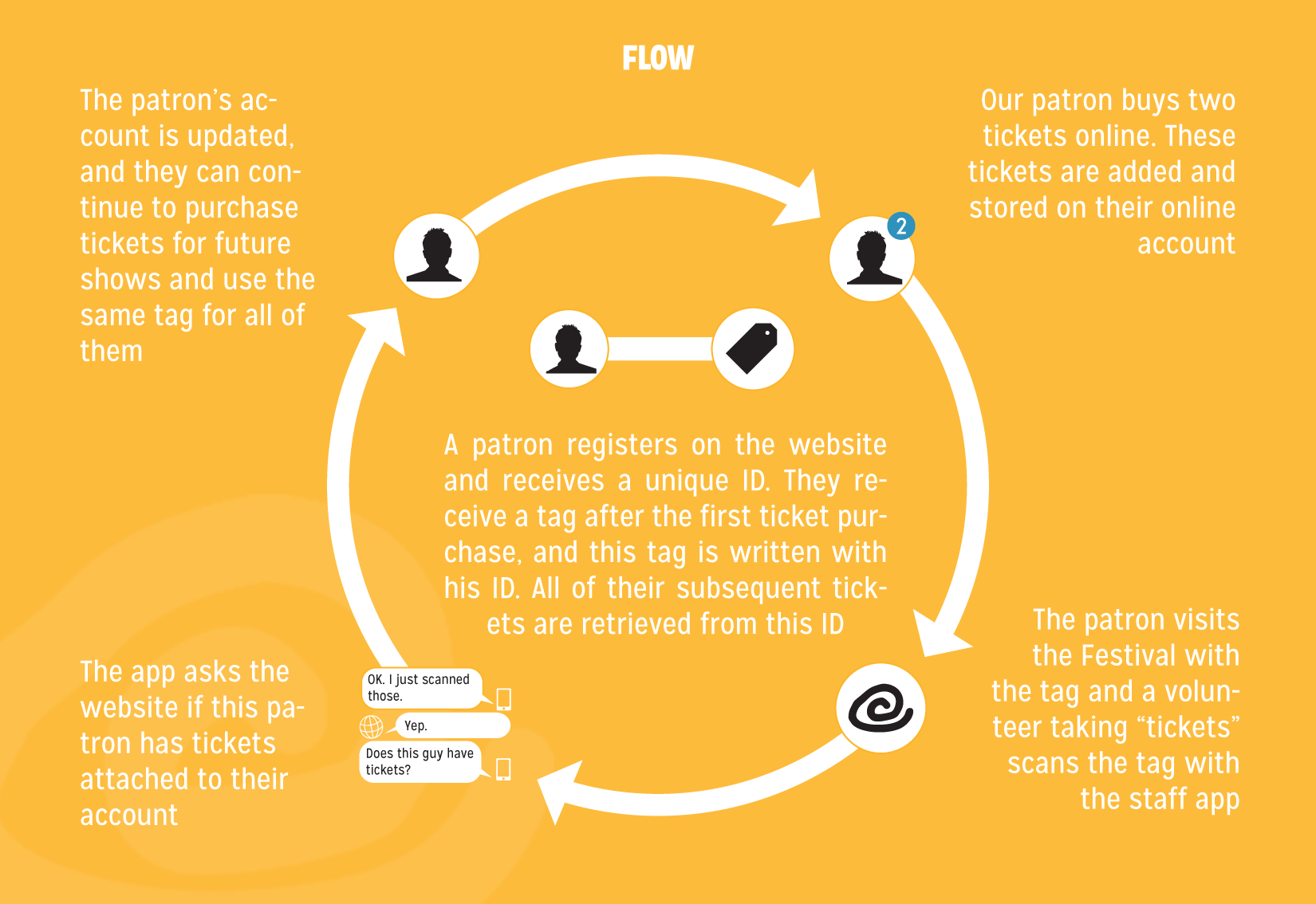
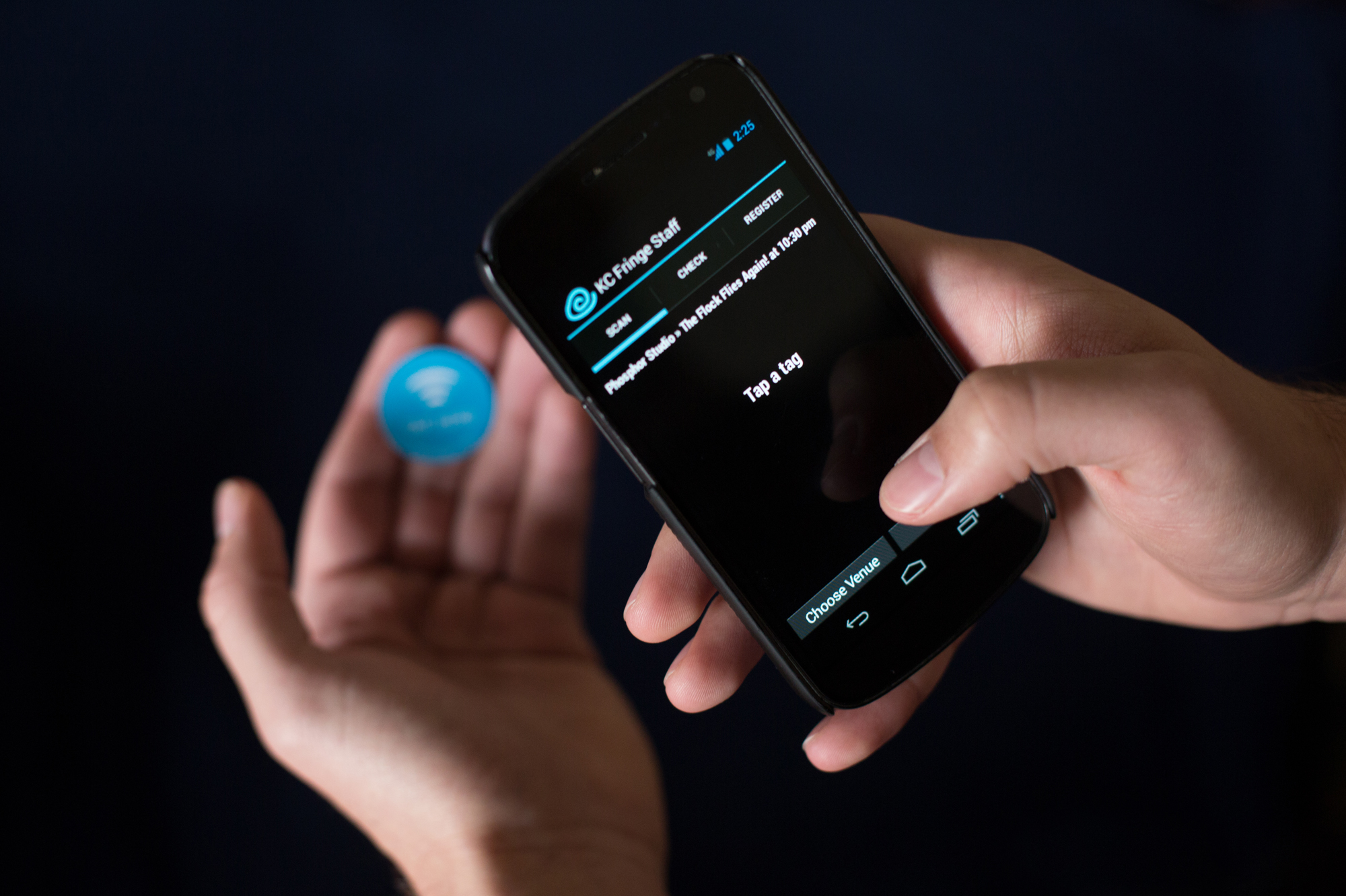
Finally, to compliment the website, we wanted to institute a new ticketing system. The Festival had required attendees to purchase a button in order to purchase a ticket. No, it didn't make much sense to us either. I've been meaning to dive into NFC tech for a while, and this was a perfect situation.
Using giveaway bracelets from an on-campus promoter, I was able to rewrite the tags to become the button and the ticket. A quick scan of the tag would verify a purchased ticket and then notify the website that the user had used that ticket, or tickets.
The app was fairly easy to put together once NFC had been wrangled with a module, and it makes heavy use of Rails' jbuilder and Appcelerator's Titanium Alloy framework.
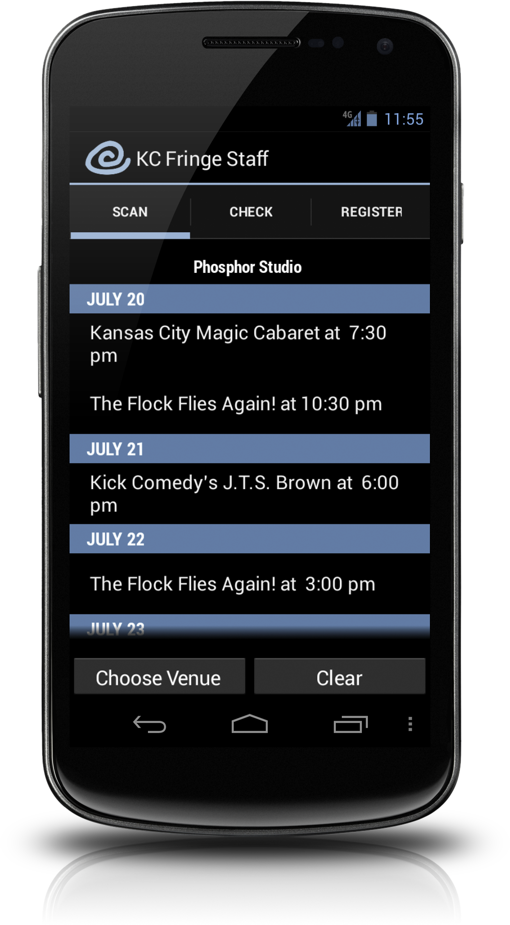
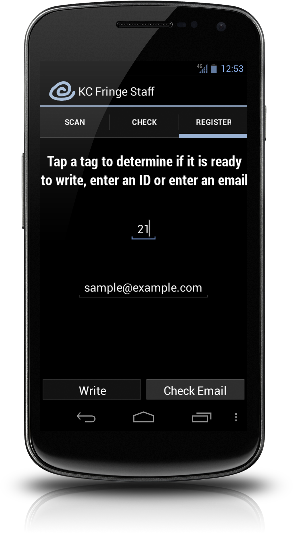
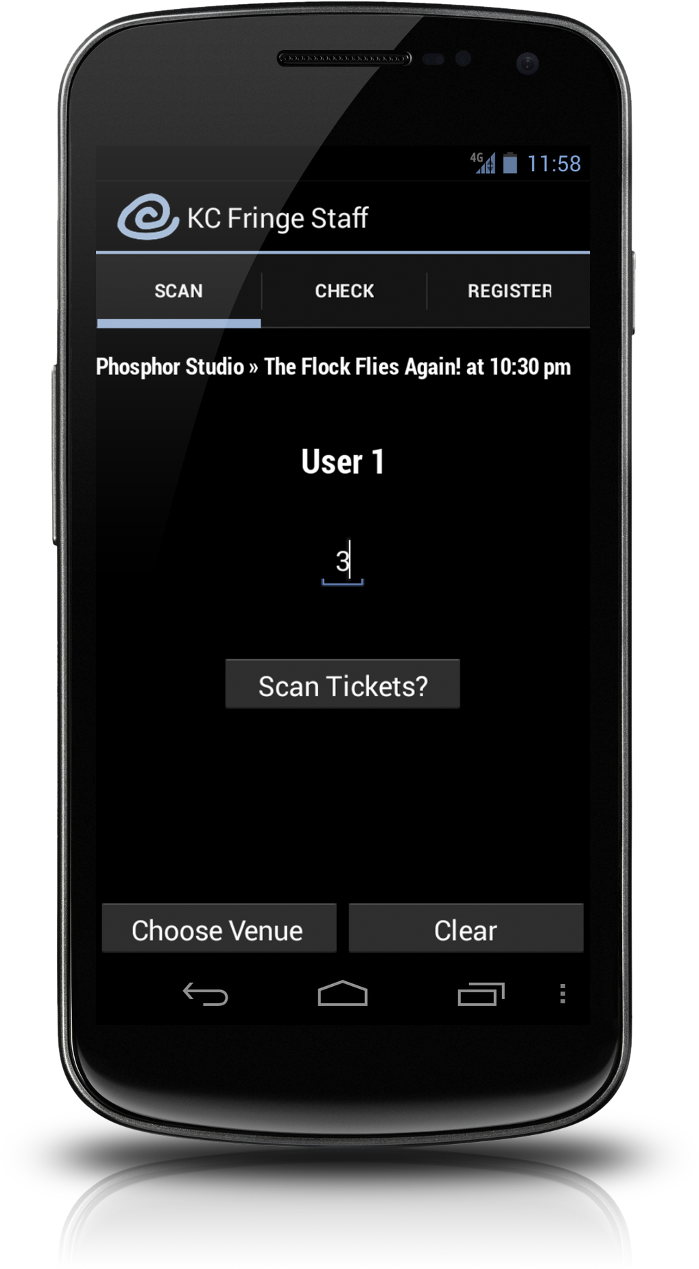
Designing the app was simple too. Especially because this was Android-only and meant for demonstration purposes only on my phone or Jeff's. Since the volunteers will be in low-light situations most often, dark backgrounds and light text is used, with minimal bright pockets so as to not ruin the experience for seated guests when latecomers show up. Also, Android's Action Bar is so much better than the old bottom tabs that ran standard.